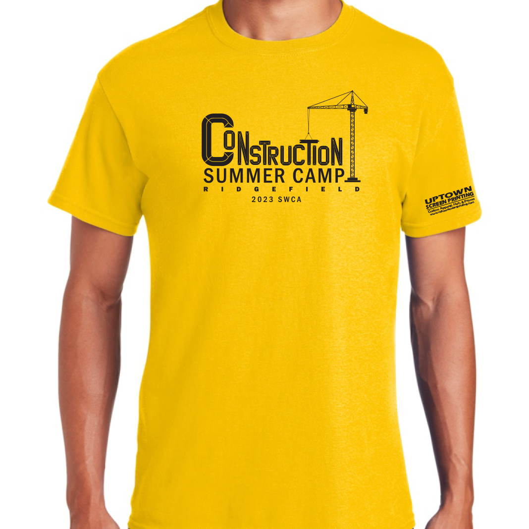
Construction Summer Camp
I was able to design a logo for a Construction Summer Camp targeted at middle schoolers. I chose to rebuild a font to make it look like it was constructed together and add the element of the steel as the cross on the “T” to add to the construction feel, in a literal way. Because construction companies use high-vis colored shirts, like yellow and orange, I chose to make the logo black on the shirts.
As for the stickers and flyers, the company that was hosting the summer camp already had a brand identity. Using their fonts and colors, I created a fun round sticker I added a construction hard hat, to try and visually balance it.